
Cost Explorer
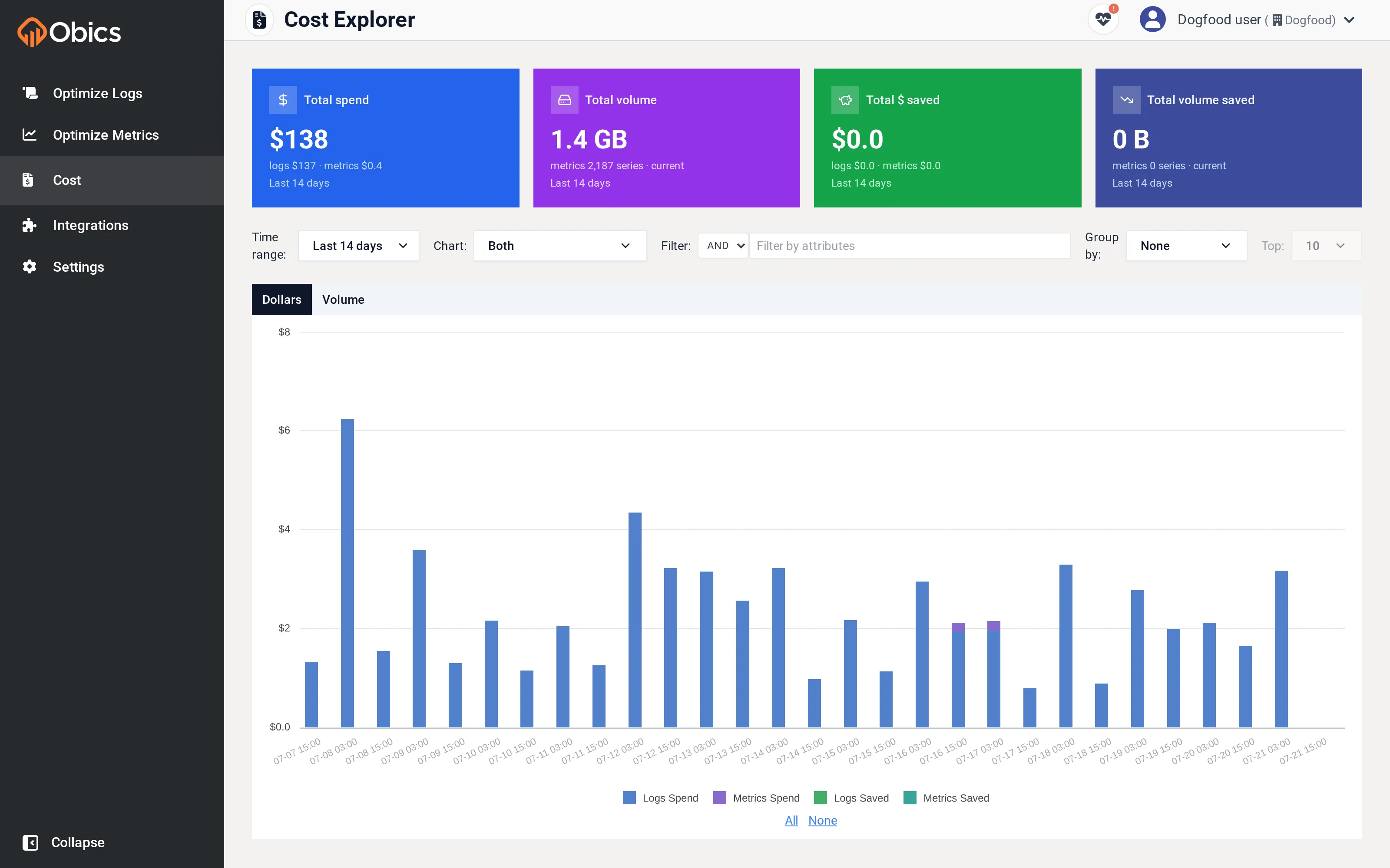
The Cost Explorer (labelled Cost in the sidebar) shows where your observability money goes over time, and how much Obics has saved you.
Summary cards
Section titled “Summary cards”Four cards across the top summarize the selected time range, each split into a logs/metrics breakdown:
| Card | Shows |
|---|---|
| Total spend | What you’re paying your vendor. |
| Total volume | How much telemetry that represents. |
| Total $ saved | Money Obics has already saved. |
| Total volume saved | The volume behind that saving. |
Controls
Section titled “Controls”| Control | Options |
|---|---|
| Time range | Last 1 / 3 / 7 / 14 / 30 days. |
| Chart | Which series to plot: Observability spend only, Obics saved only, or Both. |
| Filter | Build attribute conditions (combined with AND/OR) to narrow to specific logs. (Logs only.) |
| Group by | Split the chart by any attribute: service, etc. (Logs only.) |
| Top | When grouping, show the top 5 / 10 / 20 / 50 / 100 groups. |
| Dollars / Volume | Toggle the units the chart displays. |
The chart and table
Section titled “The chart and table”The main chart is a stacked time series of spend and/or Obics-saved, with series such as Logs Spend, Metrics Spend, Logs Saved, and Metrics Saved. When you group by an attribute, each value becomes its own series with a legend (and All / None toggles), and a summary table appears below listing each group and its total volume over the selected window.
Use this page to answer questions like “which service drives most of my log spend?” (group by service) or “how much has Obics saved this month?” (Chart → Obics saved only).